
You must log in or register to comment.
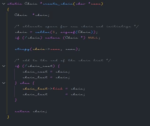
While I haven’t ascended to fully cursive coding, I do actually enjoy Fantasque Sans for this very reason.
It manages to kind of connect the letters in some ways that my eyes can better see single words as “tokens”. After using it for a while, going back to a regular monospaced font looks like a speadsheet of unconnected letters.
Is that monospaced? I am both horrified and impressed.